Tuesday, December 14, 2010

More sketchbook graphics; the tide game

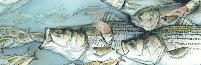
Although tides are an everyday natural occurrence, if you match the correct time of year, moon phase and amount of water flow, you may experience the phenomenon of catching quality fish at a familiar spot to the exact minute you planned on – based of course from the amount of junk you scribble in your fishing journal from season's past.

Here's a few of those mini infographics on the tide game, through different fish-holding structure*. Hit it right, and you can give yourself a pat on the back. Hit it wrong, and well – jot down more junk in your journal.

The kayak game: There's a lot of places like this along the North Shore and Long Island Sound which tides play a major role in quality of fish.


Inlets: Find the hidden rock and you'll be rewarded.


Sand bars: Again, a ton of places like this on the north shore and western sound. No happy hour specials, but some of them have crowds big enough you may think someone's handing out free beer.


*just to note, spots and areas are changed to be entirely different then the real spots I fish, to throw the scent off from fellow surf rats. Sorry about that, just protecting the innocent.

Thursday, December 2, 2010

Savour

When I have a bad period of fishing – such as a few select weeks this fall – I'll savour any decent fish I catch. It happened last weekend... the fish wasn't huge, wasn't a personal best or anything like that. Just a decent fish that had it's herring dinner interrupted by inhailing a Habs Jr. needlefish.


The catch? A few hours before I went out that night, I was so disgusted with my dry spell, I drew the cartoon above in my fishing log. That night, after I landed and released my quality fish, I added this one to my log, not even realizing what I already had on the page before, changing my mojo with the stroke of the pen = ironic. Maybe tonight I will draw a world record fish, a lifetime supply of free beer and a winning lotto ticket.

Thursday, October 28, 2010

Looking for a bird dog?


Here's a recent fun piece for Field & Stream on choosing your next bird dog. Follow the chart and see which one works best for your hunting style and personality.

Monday, August 23, 2010

Advanced Photoshop Magazine interview


Check out issue 73 of Advanced Photoshop Magazine for a nice writeup on the ever-growing niche of informational graphics. I had the pleasure to get interviewed by writer Natalie Johnson for this article. Click on the picture above to see the feature. For anyone interested in the niche, or in how we work in general, I've added the full interview below. Enjoy:

Interview:

Give us a quick background bio on you, how and why you got started and describe your career path from starting out to where you are now?

I got my B.F.A. in Illustration from Ringling School of Art and Design, class of 2002. In May of 2002 I worked as a news art intern for the St. Petersburg Times. It was there I was introduced to infographic design. In February of 2003 I worked as a staff graphics artist for Asbury Park Press, and devoted my time to informational design and illustration. I also designed weekly feature pages, which was a huge part in learning how to design infographics cleanly. I worked on subjects ranging from the outdoors, to business, history, science and sports. In the summer of 2004, I took a staff informational graphics position with Associated Press, which is where I currently work today. I also run a busy freelance business, working with clients such as Field & Stream, The Nature Conservancy, Pfizer, Boating Life, etc. My freelance career has been really rewarding and growing by the day. It's nice to carry over a staff artist work ethic into my clients' work.


What is it about infographic design that you enjoy the most?

I enjoy the challenge immensely. I was always the "read what's on the back of the cereal box" type of guy and believe with infographic design we as artists have an opportunity to teach readers something visually, which is much different then a story can do. I have a background as a traditional illustrator, and when I completed my first big infographic, it was like everything that I enjoy creating clicked.


How would sum up your style of infographics and what makes you different from the competition?
I work in multiple styles, both traditional (pencil, ink, etc) and vector, and also motion graphics. I think with infographics niche the most important thing is displaying the subject cleanly, which I strive to do with every piece. I also strive to make projects as stress free as possible for clients, which I think really helps them juggle their daily routine on their end. I really feel my experience as a staff artist helps me work with clients, in that I understand their workflow.

Why do you think there is a need for infographics today? How has this genre of illustration changed over the years in your opinion? Do you know how and why it came about?
I believe there is a high demand for them today, and its not just because I'm an infographic geek and my pay check counts on it. Infographics are useful in that they can work side by side with a story, or displayed alone as there own piece. I feel people over all have a need to absorb things visually today then ever before, and you can see it in the way magazines and advertising are designed in recent years. How they came about? Probably cavemen... that would be my guess. One of the tribe leaders was really good at spearing animals. A few of the other tribes people were tired of being gatherers, so they had him draw in the sand how to kill an animal with a sharp stick. There's your infographic. He was also very popular with the ladies, so they had him diagram grooming tips as well. Infact, the more I think about it, it was probably one of the tribes women who drew the diagram for him. Outside of grunting and throwing heavy objects, I don't think us men had the proper organizational skills.

What do you think is the point of infographics? What affect do they have on consumers/public and why?

I think to inform. How typical is an answer like that? In honesty though, you can use something like the recent Gulf oil spill as an example. You read stories on the disaster and listen to reporters tell you want they are trying to do to stop it, or you can look at a well designed infographic showing you exactly what they are attempting to do, and it all makes sense (somewhat). Graphics may assist a story with informing, or stand alone and inform as their own piece. There's also a educational side as well, such as text books in schools. The list is never ending.


How do you balance the piece - i.e is it more important to get the information across or is there more of a need for it to look good?
I always believe with our work the information comes first. You can have a beautifully rendered piece, but if the information is stale, then the work loses its point. I want the reader coming away from the piece learning something. Our business is unique in that the subjects change from day to day. I like to joke that based on my assignments, today I get to be a doctor (medical illustration), and tomorrow maybe I'll be a scientist, etc. You have to keep reminding yourself when you work on an infographic, someone reading it will be a expert on the subject you are showing. My goal is to make the work good enough to teach the experts something.

How do get work in this field? Do companies contact you? Do you pitch to clients? Is it important to have an agent?

I get most of my work from referrals or clients seeing my work printed or online from other jobs. It's important to have a personal site, so if they decide to look you up, your portfolio is a Google search away. I do pitch to clients when I have downtime, which usually consists of sending them a personal email with some work attached or a phone call. I don't have an agent, although they are definitely worth looking into for future artists getting into the field.

What is the best way for designers to get work in the infographics sector and survive against the competition?

If you have a passion for anything in the art world, you have to pursue it. Infographics are very competitive but in my experiences, it's a niche filled with great people, so they should never hesitate to reach out for advice. I would say to someone new, start with a subject you know a lot about, and try to make an infographic on that.


Can you explain your workflow to us? For example are you given a brief and the information and then how much freedom do you have; is there a lot of passing it back and forth, what do you do at the conception stage, what tools and apps do you use to create the project, how long will a project take etc?

Projects vary greatly, but with most of them I'm just given a subject or a basic story line, but sometimes I will also be given some research and reference for what a client wants, which really helps us get on the same page. There is constant back and forth throughout the whole process. I make it a habit of giving clients daily updates, like a brief email in the morning so they know where the process stands, and nothing is left a surprise. I always start my infographics researching the subject to find the best story we can visually tell (if the client doesn't already have a vision for it or the research at hand). Once I get familiar with the subject, I come up with a rough sketch on what I think we can ideally show the piece and begin researching and referencing the visuals to see if it can work. What's important here is sources. You have to know what sources are trustworthy and which ones are not (like for an example, never use sources such as wikipedia, because the information can be altered or even worse – false). This may sound like a lot of work, but I can usually have it done in under an hour. Once I have my reference and research in hand and familiarized, I'll make a more completed sketch giving the most important information the most real estate. When all parties are good with our direction I immediately render my final illustrations, and write and edit the text. I try to show as much information as I can visually to keep the piece as light on the text as possible. Depending on the piece, I will render my illustrations traditionally (pencil, watercolor, ink, etc) or digitally in Adobe Illustrator. I'm equally as fast in both. Text will also be done in Illustrator. After the art is rendered and the text is written, the piece is built in Illustrator following the design herarchy from my rough sketches. If the piece is stand alone I'll come up with a good headline and write a lead paragraph to pull it all together. Its a long process but I have a fluid system down. I've completed full infographics in under 4 hours on a rush deadline, and as fast as 3-5 days for the larger, poster-sized pieces on my site. I try to count the number of gray hairs added to my head in between, but usually stop because I remember I'm on deadline.


Can you give us your three top tips for designers practising the art of infographics and three top tips for breaking into the industry? For designers breaking into infographics:
1) Look through every outlet you can get your hands on and study the infographics that you see. Take notes on what you like and dislike, and try to incorporate that in your own visions.

2) Learn how to properly research and write, and what sources are trust worthy and which are not. A lot of clients have this step done for you but understanding sources and reference will help you go a long way with your work.

3) Lose the egos. This is very important when working with clients and in a staff job. Make the process as stress-free for your client as possible and they will call back for future jobs.
For designers practicing:
1) Again, lose the egos. I can't stress the importance of that enough.

2) Push your comfort level and constantly learn new things. It may be learning a new style or program, but you want your work to constantly move forward in both execution and content. Start looking into motion graphics and how they can be used in your work. There's so many digital outlets it may open a new direction for our niche.
3) Have a sense of humor. I really feel like you need one in our industry. Sometimes when the going gets tough you can lighten the situation with a good laugh... then of course kick some butt on the project.


Can you explain to us about one particular highlight project - or memorable project in your career thus far (please provide the final infographic image of this and any conceptual or half finished version so we can show the various stages in the way it took shape). How did this particular project came about? How did it progress? What were you commissioned to do? How many consultations did you have? How well would you say the final result was received?
One of my favorite projects in memory came about when Pope John Paul II passed away a few years ago. I came into my staff job at Associated Press that morning, and we immediately came up with a large-scale infographic showing the details of his funeral, including a cutaway of St. Peters Basilica and other heavy illustrated content. News happens fast so we wanted the entire graphic finished and moved to our wire the next day, so millions of newspapers around the world can print it. By lunchtime I got started on the illustrations and crammed myself into a small studio room armed with a pencil, few watercolors, and an old mac that had like the first copy of itunes on it (sometimes it helps to have tunes on deadline). Five hours later I had a big cutaway of St. Peters finished. It was the fastest thing to this scale I ever drew, and there was no room for error. The next morning we came in early and I drew the map and other elements, and helped built the remaining pieces and moved the graphic. Working in a team really helped us meet our deadline (we had skilled researchers, a designer, and me on the art, as well as editors checking our content as we worked). It was a wonderful experience. The next day all of the major newspapers ran the page in New York City, as well as other cities around the world. I had my morning coffee watched strangers look at the piece while they read their paper at breakfast. All in a days (well, two days) work. Also, every piece I do for Field & Stream is special to me. As a child, I had a stack of Field & Streams that rivaled most kid's comic book collection. I spent many hours drawing deer and bass from the pages of the mag while memorizing the articles. I always dreamed of working for them. I've currently been a contributing Illustrator for them for over two years now, and I look forward to every illustration.

Wednesday, August 11, 2010

Using color as a tool


You can never have too many "tools in the shed" as a professional Illustrator, and when we get lost in our sheds looking for something fresh (my shed can get pretty messy from time to time), its easy to forget one of the most useful tools we have is color itself. While experimenting, try shying away from your usual pallet and limiting yourself to one powerful color, and see where it takes you. You may hit a few road blocks at first, but when you break through you will have something to grow with.

I plan on pushing this a lot more in my personal work, but I'm also lucky enough to have clients who really want to push the envelope with their content. The talented staff at Field & Stream is one of them, and has always taken illustration and infographics to the next level while pushing the execution of content to the highest standards. I had the chance of working on the Opening Season of Hunting Feature for the 2010 August issue, where color wasn't just used as a tool, but as an entire theme.

Here's a look. One thing I enjoy with this package, is flipping through the magazine you immediately become drawn in by the intense greens, which are used in a way that is not overwhelming. This is important on your end in illustrations, to keep in mind you're not "overwhelming" you reader with the color, but rather using it in a tight, smart way – and in some cases, sparingly as these illustrations show:


Here's a a few more from the feature:


For comparison sake, here's a look at last year's package utilizing yellow as it's dominant color. It was a challenge to keep contrast in the black and white wooded areas to give the diagrams some weight, while balancing the intense yellows. I'm also posting one of my roughs, which is an important part of the process:


When I render environments, I like to keep a realistic quality to the work, that I feel sometimes gets lost in infographics. Illustrating a buck hunt in the woods is a perfect example. I want to keep that "chaiotic" feeling readers get while stalking a trophy in a mess of trees and brush (as we all know in both hunting and fishing, the "trophy" is always hiding in a place you need to get banged up to get to). I try to capture that feeling in my roughs and carry it through to the final illustration. The final render:


Here's a few more from the feature, keeping the same feeling throughout:


... And there you have it. Color so bright it'll burn you retinas. Ok, not really, but definitely a tool you'll want to keep sharp in the shed, no matter how big or small your shed may be.

Tuesday, June 22, 2010

July's Accuracy Issue


I've had the pleasure to work on this year's accuracy issue for July's copy of Field & Stream. It's my third consecutive accuracy issue and one of my favorite assignments of the year for both the challenge of the subject and displaying it in a clean, smart way.

This July, Field & Stream took a huge leap in interacting with their audience through the page
s of their magazine, by creating something readers can take out into the field and shoot... and yes, I mean physically shoot with a rifle. Lucky enough, I was able to team-up with their talented design team and create the target as part of the overall package. It's not easy to make something that says "I *heart*" anything look manly, but I think this really came together great in the end. Hopefully the readers feel the same.

Here's what New York Times had to say about the spread: http://mediadecoder.blogs.nytimes.com/2010/05/31/d
ear-readers-go-ahead-and-shoot/

For kicks here are accuracy issues of the past. July, 2009 spread illustrates accuracy expert David Petzal's rifle-range challenge:
In July of 2008, we dug into the "Accuracy Revolution", and illustrated what a hunter needs to understand to take shots that count in the field:

Monday, April 26, 2010

Ahead ...


It may be small, but this little guy was one of the first trout I've caught in nearly 10 years.

In two weeks I will be drifting through 60 miles of trout paradise on the Smith River in Montana, armed with a trusty fly rod, a lot of hope, and a rusty cast. After quickly booking the trip about two weeks ago, I tried hard to remember the last time I fly fished for trout.

Digging through fishing logs and my brain (which is commonly on trial for trivial things such as forgetting to pick up the right cheese at the grocery store, yet can remember exact details of fish caught over 10 years ago – sorry honey we're hunters, not gatherers) I found the l
ast time I fooled a trout into eating a hook covered in deer hair was the summer of 2000... and yes, I can recall the exact details.

After finding myself in this predicament (a great problem to have at that), I set off to some local rivers to dust off my trout skills. Luckily, after an hour or two of donating my flies to the river's surrounding trees, I found my rhythm and the trout followed, which I dedicate this new sketchbook entry to.
"Staying Ahead"


Monday, March 8, 2010

Portrait of Al Bensten


Every now and then a job comes around that's too good to pass up. When author, photographer, surfcaster Zeno Hromin asked if I would be interested in illustrating a cover for his online magazine of surfcasting legend Al Bensten, I couldn't resist. After a few back and forth emails outlining details I immediately sketched this up and it was a go.

Zeno and his talented team of writers, photographers and designers created this online publication to feed surf fishermens' hunger for a shore-specific publication, designing it into a central hub blog. The magazine is 100 percent online and also free. Check it out for yourself: http://www.surfcastersjournal.com/

Here's what we came up with for the cover. Al kneeling over a cow striper which fell for his signature rigged eels. While your digging around, check out my profile on pages 12-15. Thanks again Z! Prints will be available soon.

Tuesday, February 23, 2010

New Work

What do ski cross and trout fishing have in common? They are two activities that I did not partake in this past month, which is probably a positive thing when it comes to ski cross*

*True story; Last winter my fiancee and I hit the ski slopes with some friends in Vermont for the first time in over 10 years. I’m far from anything even considered “Olympian”, but I was known to be a decent skier in winter’s past. After I survived my first few runs, over confidence got the better of me and I decided busting out a 360 mid slope would really be a fun thing. What I should’ve asked myself is do I enjoy ice-rash burns all over my back because that was the outcome of that bright idea. Needless to say I get over excited sometimes.


Anyway ... onto the art. First up is a spread in the March Issue of Field & Stream illustrating trophy trout tactics. This vector style is very straight forward and clean, and I believe a nice way to bring F&S Mike Ley’s design together.


Next up we have a infographic on a new Winter Olympics event called ski cross. A lot of the Olympic event graphics I see are diagrams of rules and regs, so I wanted to do something a little different and highlight some of the technical obstacles and racer techniques for navigating them (while showing the overall scale). Here’s a screen-grab of the motion graphic for online (built in AfterEffects):


The motion graphic adapted for
mobile:

And finally the
print graphic: (art was also adapted for an interactive). My illustrations in this piece are 100 percent vector, from the line work to the color, which helped with scaling for online and mobile.

Friday, February 5, 2010

2009 surf fishing review

Big surf... early Fall, Montauk Beach
To hell with luck. I'll bring the luck with me."
-The Old Man and the Sea

In analyzing last season, I'd like to skip the entire year and fast forward to my last good fish of 2009. I like to call it, "Tale of the Broken Lami." As you can see from the title, the experience ends in heartbreak. Lets set the stage. Early November I met with some good buddies, like every other weekend of the fall, to wetsuit Montauk Point during yet another Nor'easter (I lost count by how many we had last season). The conditions were extreme to say the least, with reports calling for 40 mph gusts and heavy rain. This night we lucked out though, with the wind staying around 30-35 mph with only soaking rain (some luck I guess). Fishing these conditions is like trying to swim in a giant washing machine filled with rocks with a blind fold on. To say I spent more time tumbling around the surf then standing on my rock casting is an understatement. You can drink a lot of saltwater before your stomach starts to cramp. Determined to catch some "large" we pushed hard the entire night until we reached our limits before early dawn, only catching a few schoolie bass for our efforts.

I was exhausted, and my muscles ached to the extent that simple tasks like taking off my wetsuit and boots had my shoulders burning and arms shaking. I hunkered down in my vehicle and slept the entire mornin
g and most of the afternoon in the parking lot. When I woke around 4:30 p.m., the wind shifted and was blowing a steady 25 mph from the Northwest. I was planning on a bit more R&R (aka a few beers and a burger) before fishing the night tides, but the new wind conditions and outgoing tide pushed in a decent mass of fish north of the Point. From the parking lot I can see the boat guys were already beating up on the action, which was out of casting distance from the shore. I quickly decided to gear up and check it out myself, even though I wasn't expecting much that early in the afternoon.

I put on my cold, damp wetsuit and made my way down to a decent spot, which already had a crowd of fisherman sitting on rocks and watching the boats. The few that were fishing stayed in shallow water away from the large surf and heavy sweep. I tightened my hat and worked my way out to the action. The current was strong, and every other set of waves came in over my head. I dug my boots into the rocks and pushed my weight into the tide to brace my body against the sweep.

After casting/leaning/dancing for 10 uneventful minutes, I caug
ht a glimpse of something from the corner of my eye. A giant black head came up to the surface for a few seconds then disappeared. I cursed, thinking it had to be a seal, which would immediately shut down any chance of a bite. I focused on the spot and waited for it to resurface, when I saw another giant shadow push water up and disappear into the current. I was wrong. It was a school of big bass. Very BIG bass. It was the school of bass I've been looking for all fall, and I finally found them in the middle of the afternoon with the sun still high. Funny how irony works.

The first head that surfaced was so big, the thought of it made my hands start to shake. I opened my plug bag and grabbed a 3 oz white bottle plug, one of the only lures I had on me that would to reach the fish in these conditions, and let her fly. The plug touched down a few yards from the spot, and I cranked my reel hard to pick up all my slack line from the windy cast, allowing the bottle dig into the current. I gave two full cranks of my handle and a "tap" feeling went through the rod tip into my arms. I set the hook.
The fish slowly made its way to the surface with a good head-shake throwing a wall of white water spray which carried off into the pushing wind. I cranked hard and set the hook a second time to make sure I had a solid connection. The fish put its head down and peeled line off with the tide, dumping around half of my spool on the first run. I never let up. After a few minutes I had her head turned, and gained line slow and steady.

Every fisherman loves the moment they see their catch for the first time, and I'm no different. My mind wandered those last few yards of the fight. Would it be a giant, or maybe my personal best?
The fish surfaced and I was sadly mistaken. It was a nice striper... about 43"-44" and pretty fat. The heavy current and wind gave the fish a huge gambling chip during our fight, which made her feel a lot bigger then she appeared. A good catch, but not "the" catch.

Now, just a side note, I'm not a
big fish snob. I love catching decent fish, and would be thrilled with a night of fish this size, but this fish was a dwarf compared to the two that surfaced minutes before. I picked up the bass, and heard a few gasps from the crowd of guys on the beach, measured and released her at record speed. I wanted a COW.

The next cast is when it happened. I let some line out, arched back loading my rod for the next heave (and fish) when "POW" ... that was the end of it. My rod snapped in two just below the bottom guide, and my plug landed about 60 yards short of a school of trophy
bass in a mess of line and graphite. My trip was over. After the reality of it all set in, I gave out a good laugh. Big fish get that size for a reason. Maybe because guys like me get overly excited and break our gear when we see them.

I made my way back to shore, and was immediately stopped by a few fisherman who gave me kudos for the fish, and condolences for the mishap. I never mentioned the school of bass I was targeting. I figured they earned their stay, for how ever long they decided to hold in that spot.

Maybe next season we'll meet again. Only t
his time I'll have a backup rod in the car.


Some pics from 2009:

Early spring bass, light tackle plugging, L.I. Sound
Springtime sunrise, L.I. Sound
Kayak fishing after a foggy night, Rye, N.Y.
Ted holding his rock. Fall Nor'easter, Montauk, N.Y.